It took a little longer than expected, but the second Android M Developer Preview was released on July 9th. Google was targeting a late June, early July release, so they nearly missed their mark. The good news is that the Android M Developer Preview is more refined and in its near final form. That means performance is much better and the overall OS is much more stable.
Along with stability for the latest Developer Preview, comes a few new features that have been desired in stock Android for some time. Hopefully they’ll make the cut for the final version come this August, but we won’t know until then. For the mean time, here are the top newest features I have found so far messing with my Nexus 6.
System UI tuner is more stable, has expanded abilities
As predicted, Google has added a few more features to the System UI tuner. In the first developer preview the only available option was to customize the quick setting toggles. It was very buggy and would crash most times, but it is more stable now. When attempting to organize my quick settings in the notification shade, my System UI tuner would always crash. Thankfully that doesn’t happen anymore.
Now, the System UI tuner includes a few new options that will be mentioned below. It also includes a demo mode to show the user what the System UI tuner is capable of without messing with the settings first.
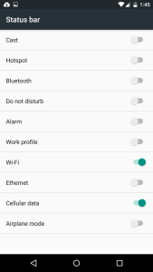
Status bar icons can now be toggled
This is something I thought Android should have had for a long time. The ability to remove status bar icons have been around in custom ROMs and even from some OEMs such as Sony, but Google has never implemented the features into stock Android. The good news is that it is here in the latest preview.
You now have the ability to hide every icon that pops up in the status bar from cellular data, WiFi connection, and my personal favorite, the alarm icon. It always irked me that the alarm icon was always prevalent in the status bar when I know my alarm is set. Especially since Android Lollipop shows the next alarm in the drop-down shade.
Another one was the Bluetooth connection. When having a smartwatch connected, the icon was always there taking up precious real estate. I like to keep my status bar clean and minimal, so this is by far my favorite addition to Android M so far.
Embedded battery percentage
Another feature that most phones are missing out on (except Sony), is the embedded battery percentage. Like I stated earlier, I like to keep my status bar clean, so having a huge 100% in the status bar is pretty annoying. Not to mention Android Lollipop didn’t even have a displayable battery percentage, aside from in the drop-down shade.
Now, it shows up inside the battery in black, so it can always be seen, even if the battery is low. I’m just hoping that Google will eventually get around to implementing the circular battery icon, that is by far my favorite. For now, this will suffice and I am very pleased Google added it.


